Wednesday/Thursday blog
UN Secretary-General, Antonio ‘the clown’ Guterres, helpfully informed us in 2022 that due to climate change it was ‘code red for humanity’. Then this year, the (IMHO) useless clod upped the rhetoric claiming that we’re now in the era of ‘global boiling‘. I imagine we’re all waiting with baited breath to find out what this idiot will be saying next year – perhaps ‘global scorching’ or maybe ‘earth on fire’ or possibly (the biblical reference) ‘global burning fiery furnace’? Who knows?
However, two areas of the Earth which don’t seem to have got the memo from Gormless Guterres are the two main ice caps. The Arctic sea ice at 19,20o km³ only represents about 0.06% of the Earth’s ice volume. The most significant accumulations of ice are the Antarctic with about 85% of the Earth’s ice and Greenland with around 13% of the planet’s ice. If all the ice in the Antarctic were to melt as the planet boils, that could raise sea levels by an impressive 58 metres. If Greenland’s ice were to melt as the planet boils, that would raise sea levels by about 8 metres. Given the catastrophic effect a major ice melt would have on our world, it might be worth checking what is actually happening to the two main ice accumulations in our ‘boiling’ world.
Antarctic still pretty cold
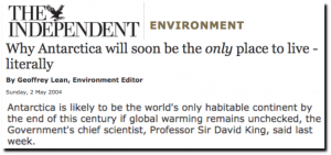
In 2004, the UK government’s former chief scientific adviser, Professor Sir David King, was quoted as having suggested that by the endo of this century – in just 77 years – the Antarctic would be the only habitable continent:
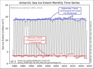
However, satellite data suggests that Professor Sir David may have been a little premature in his predictions because the trend for Antarctic ice suggests a gradual increase over the last 42 years of around 5,000 km³ per year in the winter and 3,000 km³ per year in the summer:
(left-click on image, then left-click again to see more clearly)
There does seem to have been a dip in Antarctic ice extent around 2017 to 2019. But this followed an above-average quantity in the period from 2012 to 2015, so cannot be seen as a trend. Astonishingly, as our planet supposedly boils, the planet’s largest ice mass keeps increasing.
Greenland not getting any greener
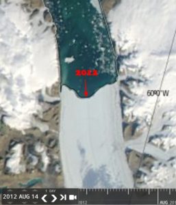
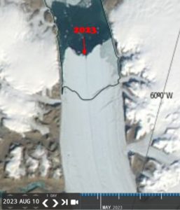
Meanwhile, up north in Greenland, the Petermann Glacier has advanced 13.4 km since August 2012. Here’s how it looked in 2012:
And here’s a more recent image with a line added to show the increase in the last 10-11 years:
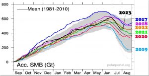
Overall, the quantity of ice in Greenland this year seems to be above the exceptionally low year 2019 and also slightly above 2020, 2021 and the mean for 1981-2010:
But it’s below 2017, 2018 and 2022. which suggests that as the planet has moved from ‘code red for humanity’ to ‘global boiling’, Greenland’s ice cover hasn’t really changed that much. If anything, there may be a slight increase, especially compared to the 1981-2010 mean.
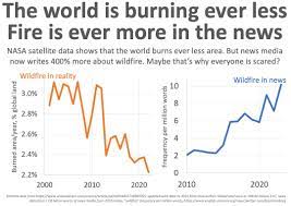
This is all very confusing. Perhaps the inimitable Björn Lomborg best summed up the discrepancy between what our rulers and their sycophantic media tell us and what’s really happening when he showed the difference between the area of the Earth consumed by wildfires compared to the number of times wildfires were mentioned in the mainstream media:
It may seem that the less evidence there is of global warming, the more hyperbolic our hyperventilating elites and media become.






I think graphs and explanations don’t stand a chance against propaganda from the TV. Chris Packham ended his Earth series having described catastrophic past events by saying the Earth now faced its biggest threat of all – human activity.
Propaganda is the name of the game, not scientific explanations and observed data. There was a recent post on Principia Scientific saying the Antarctic has plunged to -83.2C, its lowest temperature since 2017. Detail is lost when it isn’t even average temperatures that are discussed but variations from the average and of course maximum temperatures but never minimums.
I still believe that we have to go back to the basic descriptions of the greenhouse effect. It is complete nonsense and has been shown to be nonsense by experiments with model greenhouses. Also modern experiments repeating Tyndall’s work which are all faked and nothing more than magic tricks that can easily be explained. But propaganda works especially when spoken with the authority of somebody on TV. This is why you will never be invited on TV to present your explanations.
The Earth’s energy budget diagrams need to be explained because they show without any need for science why the entire theory of an atmospheric green house effect is nonsense. These were produced by Kiehl and Trenberth and promoted by the IPCC. It shows the energy from the sun reaching the surface as 168W/m2 but the energy from the atmosphere as 324W/m2 from the concept of backradiation. The atmosphere cannot generate thermal energy and certainly not twice the amount received from the sun. This is the nonsense that supports all our crazy energy policies.
If the circulation of energy in the atmosphere as shown in the diagram is possible, then we could do this with our homes. All we have to do is connect them all together with a pipe to transfer heat from to another and then connect the fist to the last to form a loop. We turn on the heating in the first house and pump it around until it gets back to the start. Then the magic happens. We turn off the heating in the first house and the heat just keeps circulating and everybody is warm without any fuel bills. This is what the masses believe happens in the atmosphere through propaganda that starts in schools and keeps them ignorant.